Research and planning blog tasks
1) Find at least five music magazine front covers aimed at a similar target audience to your project and research music magazine key conventions. For each one, pick out one design idea, convention or image/text style that you could use in your own print work.
1 - I chose this Billboard cover of Charli XCX to try gain inspiration from the original music artist. What stood out to me most from this cover was the typography, colour scheme and how the central image was constructed through her pose. It features minimalist design, with a monochromatic central image that is only interrupted by the tone of green present on the masthead and the artist's name. She has been photographed while in action (putting on a stiletto boot) which is something I would like to incorporate in my cover's central image. The choice of font mimicking an inky typewriter seemed unique to me and stood out, so I will try to be intentional with my own font choices.
2 - I chose this Rolling Stones cover of Chappell Roan to explore the use of hair and makeup. Chappell Roan is known for distinctive art direction in her work which is something I felt I have not been able to establish well enough yet so I was keen to look into this. The use of a black background creates more emphasis on her vibrant makeup and her hands are positioned around her face to create this same effect. In this cover each part of her appearance is very intentional, from her acrylic nails to her pink clothes and vivid red lipstick, successfully establishing a star persona, which is I will try to implement in my own magazine cover.
3 - I chose this Billboard cover of Metro Boomin to explore how to include cover lines and text on the cover, as the brief requires five cover lines to include. The text is framed around the central image of the artist, a wide shot that covers some of the masthead, and utilises bold sans-serif fonts to create an edgy, modern and masculine appearance. This cover features many cover lines featuring different stars while avoiding looking cluttered, which is something I will try to do in my own magazine cover.
4 - I chose this Music Week cover of Beabadoobee to explore colour grading and setting. This cover features the artist outside with a natural background, with the masthead and cover lines placed over the sky, allowing the central image to be where the viewer's gaze is most directed. Colour grading is used to make the central image appear warmer to reflect the climate of the background and influence the general mood of the cover, along with the bright yellow used in the typography.
5 - I chose this Music Week cover of Yungblud for its colour scheme and the pose. The cover features the artist behind a light background with his full body in view, using direct address which is emphasised by the striking eyeliner he wears. The majority of the colour scheme features dark tones which allows the bright pink of the masthead, title and his socks to pop as an accent colour. The cover also features a quote from the Yungblud feature in the magazine.
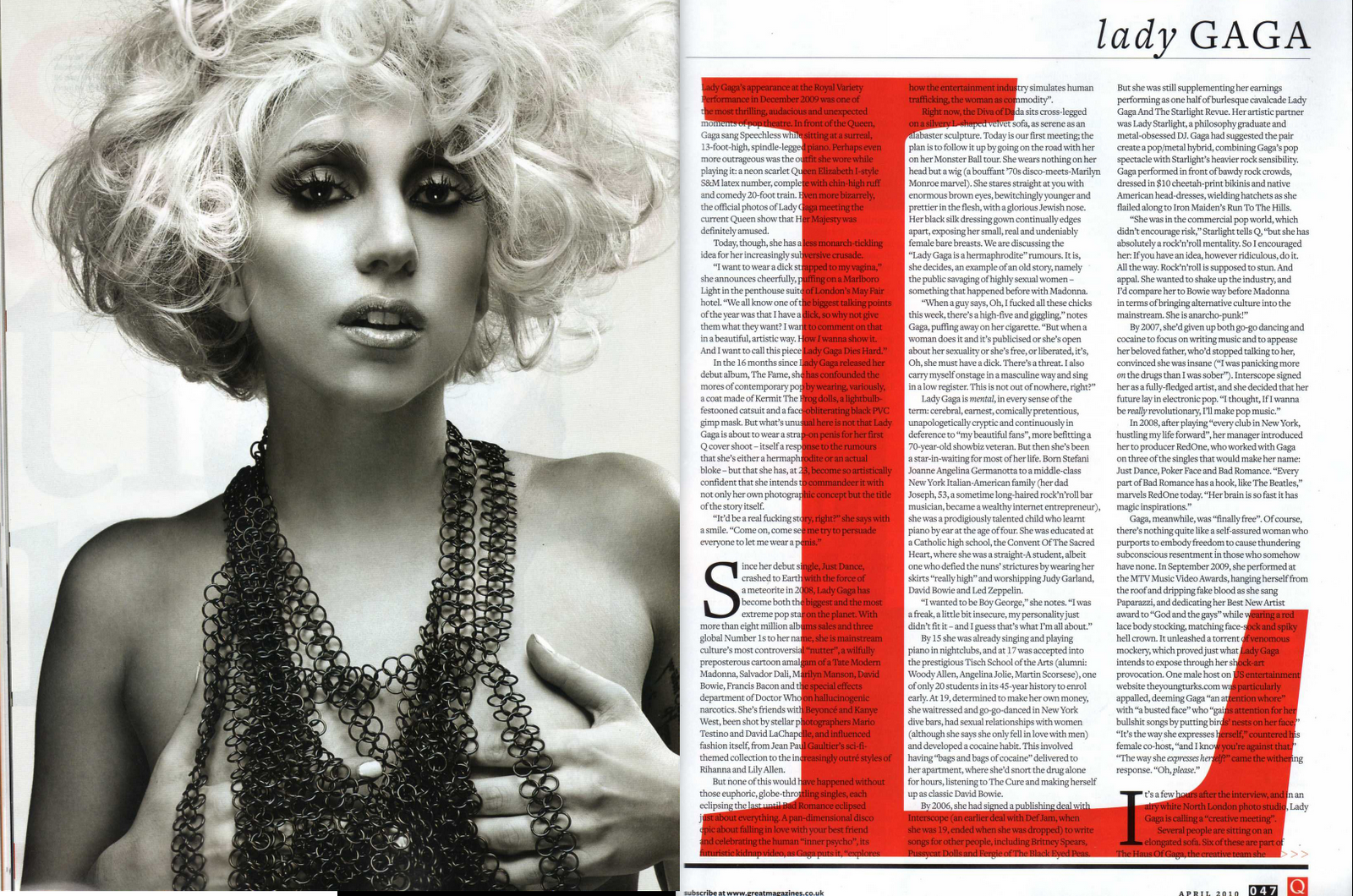
2) Find at least five double-page spread features from music magazines on Google images. How are they designed? How are text and images displayed? What design tricks can you borrow from your examples?
These music magazine double page spreads feature images of the artist that take up at least one page, showing how important the photoshoot is for an artist feature in a music magazine. The stylistic choices of the double page spread are cohesive between the main image and the choice of colours and font with the text, as seen in the first example which is monochromatic with bold letters for the headline. The actual text of the interview is much smaller, but quotes from the interview are written in between the main body to draw attention to them, sometimes highlighting the quote in the main colour of the spread.
3) Find at least five magazine contents pages - ideally from music magazines - from Google images. How are they designed? How are images used alongside text? How are page numbers displayed?
Through these examples it is obvious that photos of the artist are prominent in contents pages, featuring a main artist for the largest image and some smaller images for related artists that are also featured in the magazine issue. The contents page has different sections for features, the cover story, and reviews for bands. All the examples above utilise sans-serif font with bold text and use colour schemes with high contrast such as black and yellow or black and red.
4) Find at least five music artist tour posters from Google images. How are they designed? How are images used alongside text? Which UK venues would suit your artist or band?
These examples of artist tour posters utilise the core imagery of album releases to announce their tour, taking up at least half of the poster. Colour is a large component of the posters and establishes the genre and overall atmosphere of the tour and musician. The tour dates are written with a small font size using a sans-serif font so that the main focus of the poster is the image and name of the artist.
5) Read at least three example music interview features from newspapers and magazines to learn the format, writing style and content for a music magazine interview.
Planning and sketching
1) Plan the content and cover lines for your front cover:
- Title (must be NEW original mainstream music magazine you have invented): Amplify
- Slogan: Turning Up The Volume
- Cover image: The artist looking to the side while lying down on a blanket, with polaroids around her, the most prominent ones being the two smaller images
- Main cover story/main flash: White Roses exclusive: Is Everything Still Romantic?
- Additional cover lines:
- Additional two smaller cover images: Two smaller photos will be of the couple in the music video
- Font style / colour scheme, additional design aspects: For the title I want to use a strong font like Futura Extra Bold Condensed. For the slogan and cover story I would want to use a serif font like Sawarabi Mincho. I also want to involve a slight yellow colour tint similar to the Music Week example.
2) Plan the images you will use for the front cover - use the elements of mise-en-scene (CLAMPS). One main image and two smaller images required to meet the minimum content in the brief.
- Costume: Casual clothing
- Lighting: High-key lighting
- Actor placement: Lying down on a blanket, looking to the side, framed slightly to the right
- Makeup and hair: Warm tones - blush and eyeshadow with dark red lipstick. Hair will be out flowing in the background
- Props: Polaroid images around the artist
3) Plan the content for your inside page feature:
Subject of feature:
Headline:
Subheading:
Main image:
Smaller images (need minimum of four across the three pages)
Font style / colour scheme, additional design aspects:
4) Write the 400 word interview feature you will use for the inside page spread. This must be 100% original and written by you. It may help to use a Q&A approach to this interview.
5) Plan and write the text for your contents page. This will need to include a range of features and interviews that are not related to your artist but that do fit your target audience and brief (mainstream music magazine).
6) Research and select the font or typography you will use for your magazine. This is a critical element of your print work - the brief requires a consistent house style running through all of your pages.
7) Produce an A4 sketch of your front cover design and scan it/upload a picture to your blog.
8) Produce A4 sketches of your inside page feature with clear layout of where headline, subheading, images and text will appear on the pages. Scan or upload a picture to your blog.
9) Produce an A4 sketch of your contents page design and scan it/upload a picture to your blog.
10) Finally, create the pages in Adobe Photoshop or InDesign so you have the documents ready to go in terms of adding your text and images. This will need to include:
A4 portrait for front cover
A4 portrait for contents page
A3 landscape for double page feature
Photoshoot
1) Who do you need to photograph for your front cover and inside page images? Remember, you need seven original images across the whole print production.
I will have to photograph myself for most of the shots and also have some photos with the other person in my music video (Izabela) for some of the smaller images.
2) What camera shots do you need? Write a shot list or draw a storyboard for your photoshoots. Make sure you plan a variety of camera shots you will look to capture - medium shots, close-ups etc.
- Medium shots
- Close ups
- Wide shots
3) Plan the mise-en-scene. What costume, props or make-up will you require for your photoshoots?
- Costume: Casual clothing
- Lighting: High-key lighting
- Actor placement: Lying down on a blanket, looking to the side, framed slightly to the right
- Makeup and hair: Warm tones - blush and eyeshadow with dark red lipstick. Hair will be out flowing in the background
- Props: Polaroid images around the artist
4) Finally, note down the time and date for your photoshoots. This may be inside or outside school (or a combination of both). You will have Media lesson time for this after the mock exams.
Half term


.jpg)


.jfif)
.jfif)

.jfif)


Comments
Post a Comment