Film Poster Analysis
Blade Runner
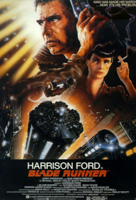
Analysing the poster, this movie could possibly be about the advance of technology. This is signified through the futuristic city displayed in the foreground of the poster. Through this, it can be inferred that the movie is set in an interpretation of the future that could be dystopian, indicated through the tagline "Man has made his match...now it's his problem." This suggests how technological advances could be a problem or obstacle for the protagonist of the movie, evidently played by Harrison Ford as suggested by the lighting, with his stern face illuminated in the centre of the background. Props also suggest conflict, with the gun connoting power and the iconography of the cigarette of the female side character (shown through her smaller position on the right side of the poster) connoting immorality, perhaps suggesting her position as a possible antagonist.
Genre:
The poster effectively presents Blade Runner as a sci-fi movie through its futuristic setting and conventions, including its choice of clothing and props for the two characters featured. The iconography of a cigarette is also inspired by film noir and its idea of the femme fatale.
Audience:
At the time, this movie would have been marketed towards a more specific demographic than just mainstream audiences, which could let it be described as an art-house movie. As a genre sci-fi has generally been targeted to younger audiences, especially younger men.
Scary Movie 2

Storyline:
Analysing this poster, this movie seems to be a comedic or parody spin of pre-existing horror movies. This is signified through the various costuming, such as the "What Lies Beneath" T-Shirt worn by the female character to the left, the male character in the back left dressed as the priest from The Conjuring and the Hannibal Lecter mask worn by another character in the background. This could suggest the movie incorporates parodies of various horror movies and conventions, with the tagline "More merciless. More shameless." suggesting it is intended as more of a raunchy parody than a commentary on any of the horror movies it borrows characters and scenes from.
Genre:
Through the review quote and title, it is evident that Scary Movie 2 is a comedy movie, with the sole goal to poke fun at the pre-existing horror genre. The various expressions of the cast on this poster ranging from scared to cautious juxtaposed with the tongue-in-cheek costuming ("I ♥ Dead People" being a reference to the horror film Sixth Sense's "I see dead people") create a kind of satirical humour within the poster itself.
Audience:
While Scary Movie 2's audience is intended to be more mainstream, appealing to the general public's familiarity of the zeitgeist of 90s and 2000s horror, its unrestrained humour would only appeal to younger audiences such as late teens or early 20s, who are both demographics known to enjoy horror and provocative, almost gross comedy.
Uzak

Analysing the poster, we can immediately assume that this movie is one of melancholy, presented by its gloomy background with dark, foreboding clouds. The choice to focus on the landscape of the desolate setting, with only one person visible, communicates to the viewer how lonely the protagonist of this film may be. Furthermore, the use of a quiet winter landscape signifies to the viewer how the story of this protagonist may be one about isolation and despair.
Audience:
As a foreign language film (suggested by the title of the movie), this may not have as much mainstream appeal as other movies, however there is still a niche audience for this movie, shown by the Grand Prix Cannes award displayed above the title that it got in 2003 at the Cannes Film Festival, suggesting it may be another art-house movie intended for a smaller, more educated or "cultured" audience, also meaning it may be targeted at an older audience.
Genre:
As suggested by its foreboding setting, this may be a drama, with a potential outlook on the sorrows of life or loneliness.
I'm Not Scared

Analysing the poster, this movie may be about a challenge the main character in the centre of the poster has to overcome involving the hole in the ground that serves as the foreground of the poster, framing the child for a claustrophobic feeling. It may involve another character falling into said hole, or some other possible conflict caused by it, upon where the main character will have to confront their fear, hence the use of the title "I'm Not Scared".
Audience:
This movie may be targeted at more of a niche audience, perhaps suggested by the choice of casting a child as the main character in a thriller movie. That being said, there would definitely be a focus towards a younger demographic of people, and maybe a focus towards a younger male audience due to it being a thriller.
Genre:
In this poster the genre is very clearly stated in the tagline, with this movie being a thriller movie, however it could also be easily interpreted from the title, the character's scared expression and the reviews placed at the top of the poster saying it was "filmed with...visual intensity".
Sin City

Analysing the poster, this movie may be about inner-city crime, with the main cast either aiming to stop criminals through violence or being the ones who cause the crime themselves. The composition of the characters suggests that the main in the centre middle of the poster may be the main character, with the two characters on his right being his fellow heroes and the two characters on his left being villains.
Audience:
This movie would be targeted at an older audience, possibly due to a level of violence in the film, but its position in the action genre would make it marketable to mainstream audiences, especially male film-goers.
Genre:
Through both the bold red typography of the title and the dominant iconography of the guns in this poster, it can be assumed that this is an action movie with elements of crime. Furthermore, the monochromatic color scheme of this poster and the casts' costuming connotes imagery of the film noir genre from the 1940s, perhaps suggesting Sin City falls into the neo-noir genre.
Pirates of the Caribbean: Dead Man's Chest

Through the composition of the poster, this movie may be about the male protagonist (at the top left of the poster), the supporting character and the possible romantic interest of the hero being pirates as part of a crew, also signified by the choices of costuming. The gun in the protagonist's hand connotes imagery of power, suggesting conflict in the film, which is made even more evident through the pirate ships displayed in the murky ocean setting in the foreground of the poster, where tentacles seem to surround one of the ships, suggesting possible encounters with mythical beasts or sea life. This signifies that there will be a high level of action and tension in the movie, as our main cast may have to struggle against both the power of the ocean and the creatures lurking within.
The title of this movie being "Dead Man's Chest" implies a new goal or treasure for this crew to search after, perhaps leading to their struggle against other possible antagonists and the forces of nature.
Audience:
This movie would most likely be targeted to a mainstream, younger audience, due to its subject matter of pirates and adventure, but also with the poster seeming to suggest the movie will follow most conventions of fantasy movies, such as high-stakes action and fight scenes, a typical portrayal of a passionate romance, and other such cliches that could be enjoyable for a vast majority of young audiences, but perhaps not older ones. Furthermore, this would also be targeted to a vastly male demographic, typical of most action movies.
Genre:
This film seems likely to fall under the fantasy genre, with the title "Pirates of the Caribbean" evidently suggesting it to be a swashbuckler movie, where the leading hero will pursue a daring adventure in search of a hidden treasure, and face off against a cunning villain as a result.
Bride and Prejudice

As suggested by the title and displays of two settings, one of them being a large Western (possibly American, due to some of the palm trees) cityscape to the left and the other being the Taj Mahal to the right, this film is most likely a modernised Bollywood remake of the original Pride & Prejudice novel written by Jane Austen. The juxtaposition of the Western and Indian settings, including costume choices of the Western clothing styles and traditional Indian garments for the background characters in the poster, signify that the movie may be about cultural clashes between the relationship of an American man and an Indian woman (the lead actor and actress positioned directly in the middle of the poster) interwoven into the original themes of Austen's story, about the impact of first impressions, romance, the search for yourself and the effects of your environment and class. Of course, as a Bollywood rendition of the story, it would lean more into a comedic and jubilant tone, suggested through the poster's vibrant colour scheme and lighting, and the review quotes calling it "romantic, funny and so sexy".
Audience:
As a Bollywood movie directed by Gurinder Chadha ("From the director of 'Bend It Like Beckham'"), it is expected for Bride & Prejudice to be targeted towards an Indian demographic, however, the inclusion of American culture suggests that this film is intended to be a mainstream movie with commentary about the ways marriage and romance are explored through different cultural lenses. Due to this, it could be said that this film would have a target audience of older teens and younger adults. As a romantic movie with drama and comedy elements, it would conventionally be marketed towards women, who make up the main demographic of romance viewers.
Genre:
Being a product of the Indian Bollywood industry, this film would be a hybrid of elements from multiple genres, such as comedy, drama, romance, social commentary, and musical numbers. However, Bride & Prejudice is most likely to fall into the romantic-comedy or romantic-drama hybrid genres.
Million Dollar Baby

Million Dollar Baby's poster immediately communicates the dramatic themes of the film through the use of low-key lighting, creating an stark chiaroscuro lighting effect. The composition, actors' expressions and even typography of the poster also support the idea of it being an intense drama with tension and suspense. More of the mise-en-scene allows us to infer the storyline; the costuming choice of a sports bra for the female lead character shows the film may be about an athlete, particularly a boxer as indicated by the hairstyle of the female lead. Perhaps this movie is about a boxer and her coach who may be one of the male characters and her aspirations for success, hence the title Million Dollar Baby.
Audience:
This movie may be targeted to older audiences who would be able to appreciate the story and trials of pursuing success more than a younger audience would, however, it would still likely have mainstream appeal due to the notable actors displayed on the poster.
Genre:
This poster presents the movie as a serious drama film.

Comments
Post a Comment